

 Then click on +Tile to select from the drop-down menu Control Tile.
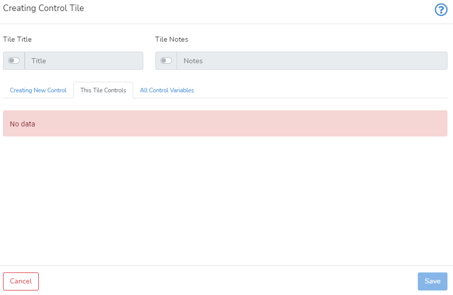
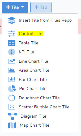 Selecting Control Tile will bring up the window shown below.
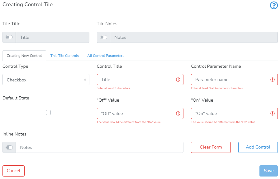
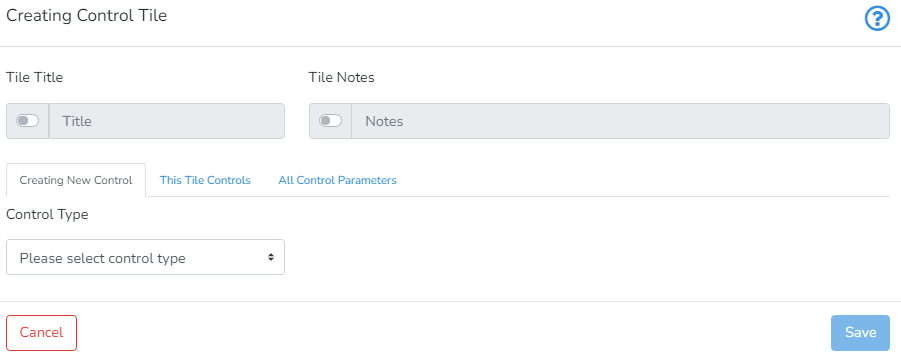 The user can provide Tile Title and Tile Notes (to provide more information for other users or for future reference) by activating the switch on the left side of the respective text box.
 Horizontal Slider
The horizontal slider is used to control a numeric value limited by minimum and maximum values. A typical example of creating a new horizontal slider is presented below.
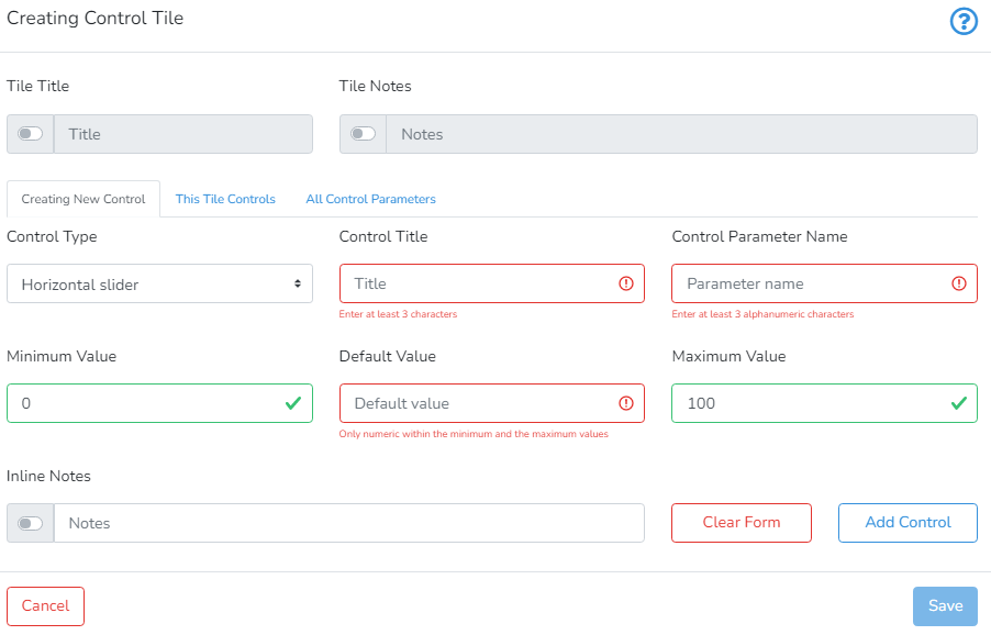
To add a horizontal slider, the user must provide the Control Title, Control Parameter Name, Minumum Value, Default Value, Maximum Value and Inline Notes.
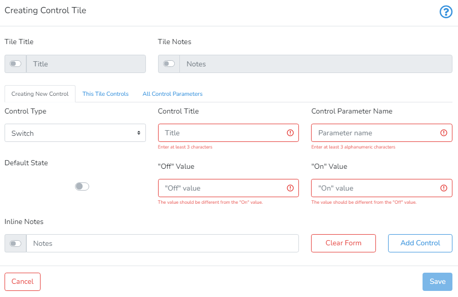
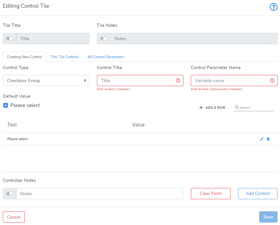
Control Title defines how the control will be visually identified.
Control Parameter Name should be unique within the parent project. Only alphanumeric characters and underscore are allowed.
Minimum Value >= Default Value >= Maximum Value should be ordered integers.
Inline Notes are optional and their visibility can be toggled with the switch.
After you are done, click Add Control to add the control to the control tile.


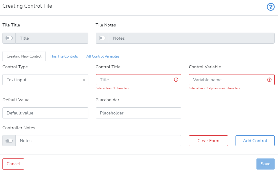
 Clicking on All Control Variables shows the list of all control variables for this project.
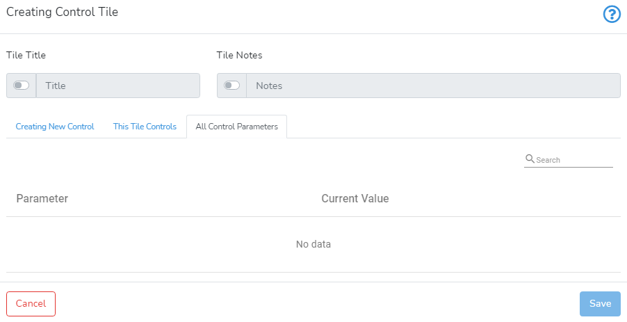 Once you are done, you can press Save in the bottom right-hand corner to save and create the control tile.
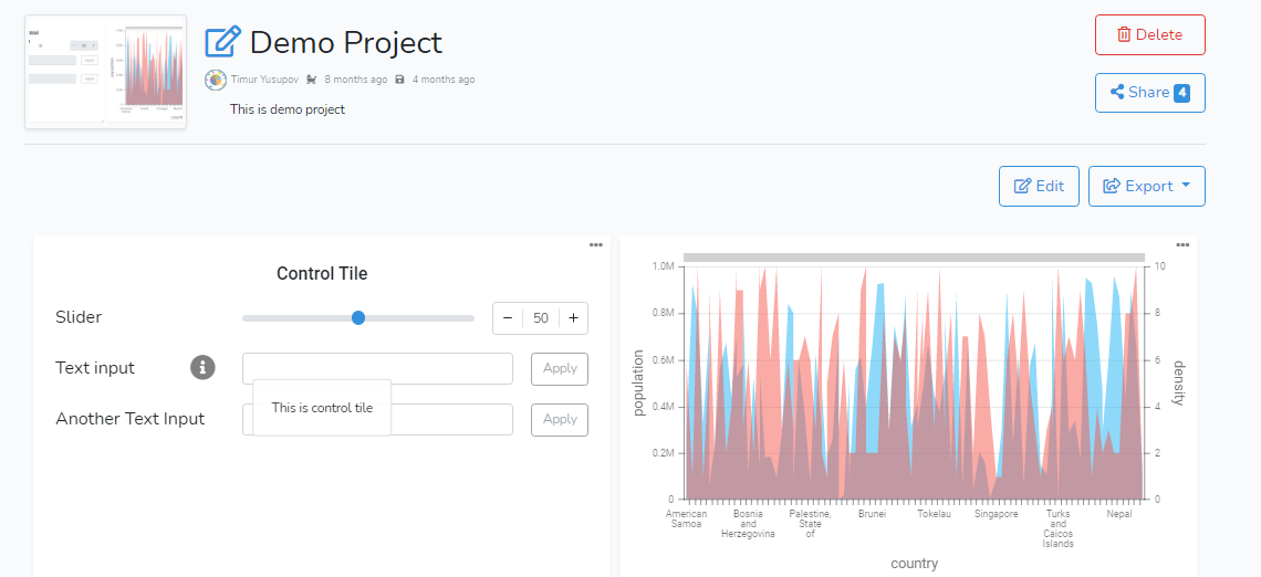 If you want to edit the control tile or change its control type, simply press the grey pencil icon in the top left-hand corner.