How-to

Create and Manage Tiles:

Charts

This is a tile-specific continuation of How-to Create and Manage Tiles.

This section guides users on how to create and manage content tiles.

DataYeet has currently six different chart types including the line, area, bar, pie, doughnut, and scatter/bubble chart.

The user needs to have at least one data connection before any tiles can be added.

To create a new Chart Tile, click on +Tile in the project edit mode. Then select one of the charts highlighted in the picture above.

The user can change the chart type by clicking on the button with another chart type located in the header of Add/Edit tile dialog.

For most of the content tiles, adding and editing the tile is done in three steps: selecting the data connection, selecting the data, and formatting the chart.

Step 1: Data Connection

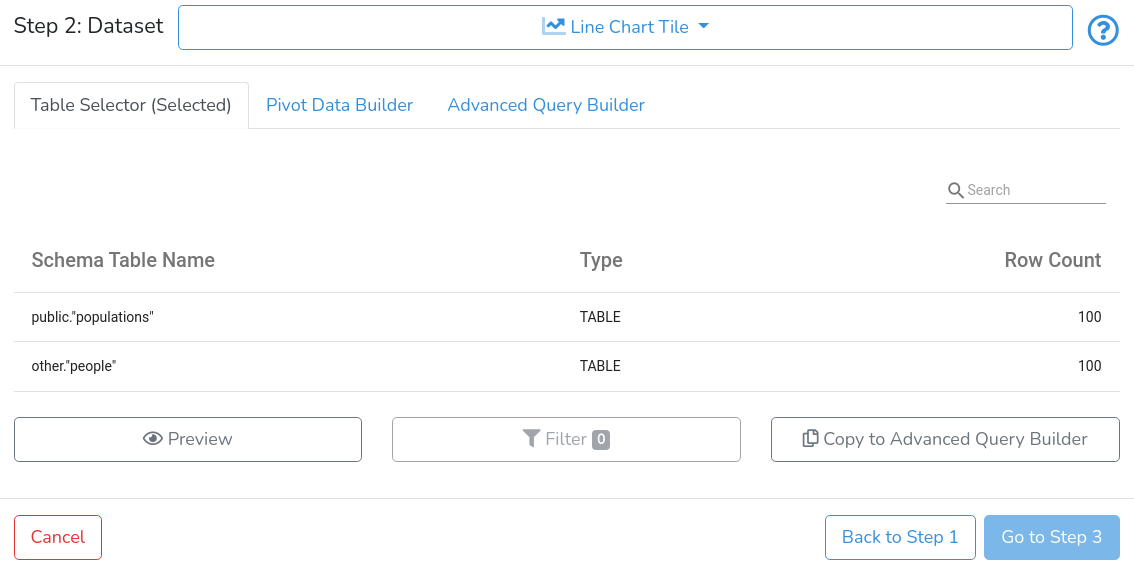
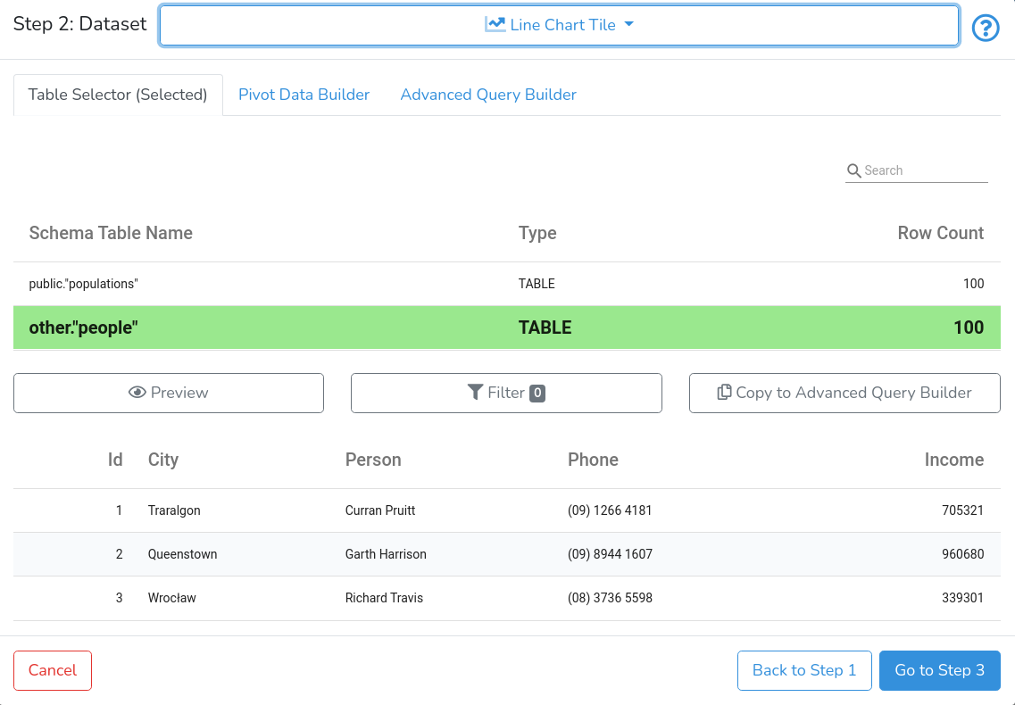
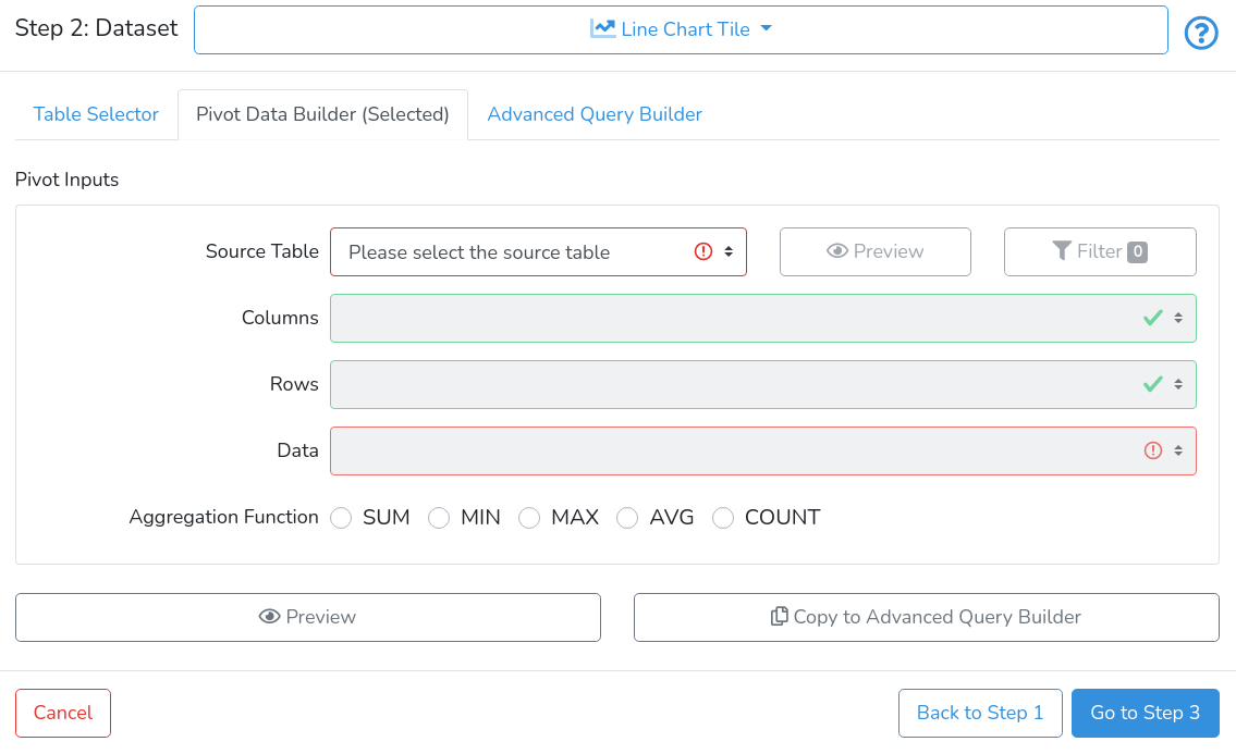
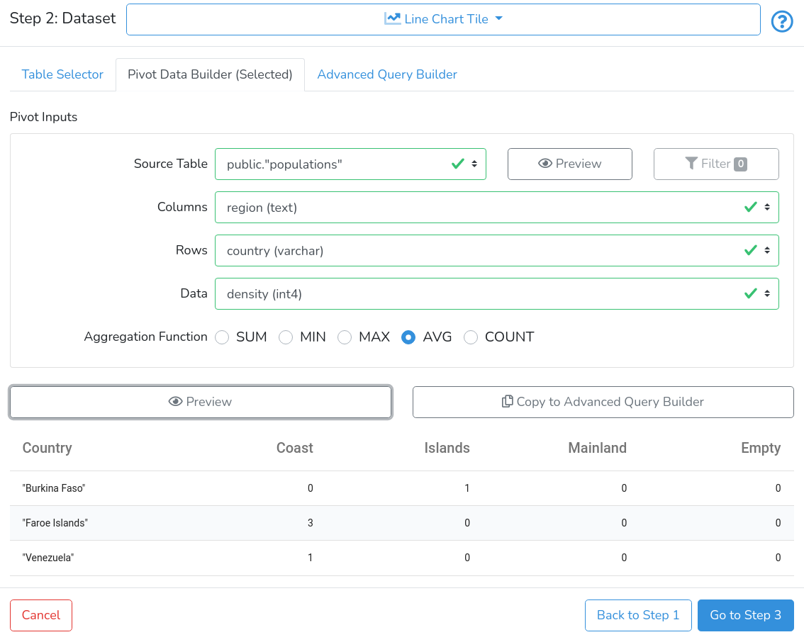
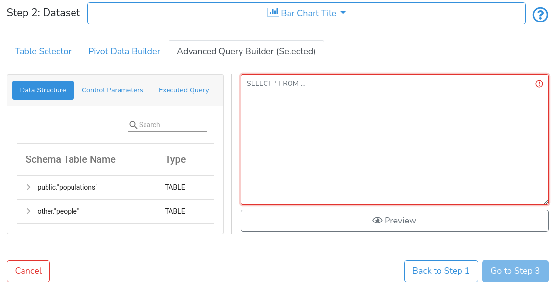
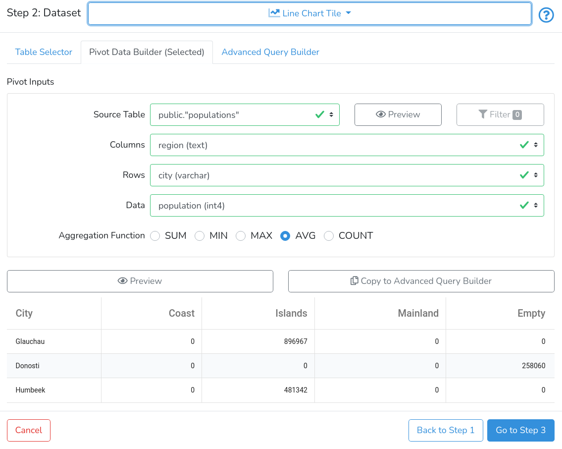
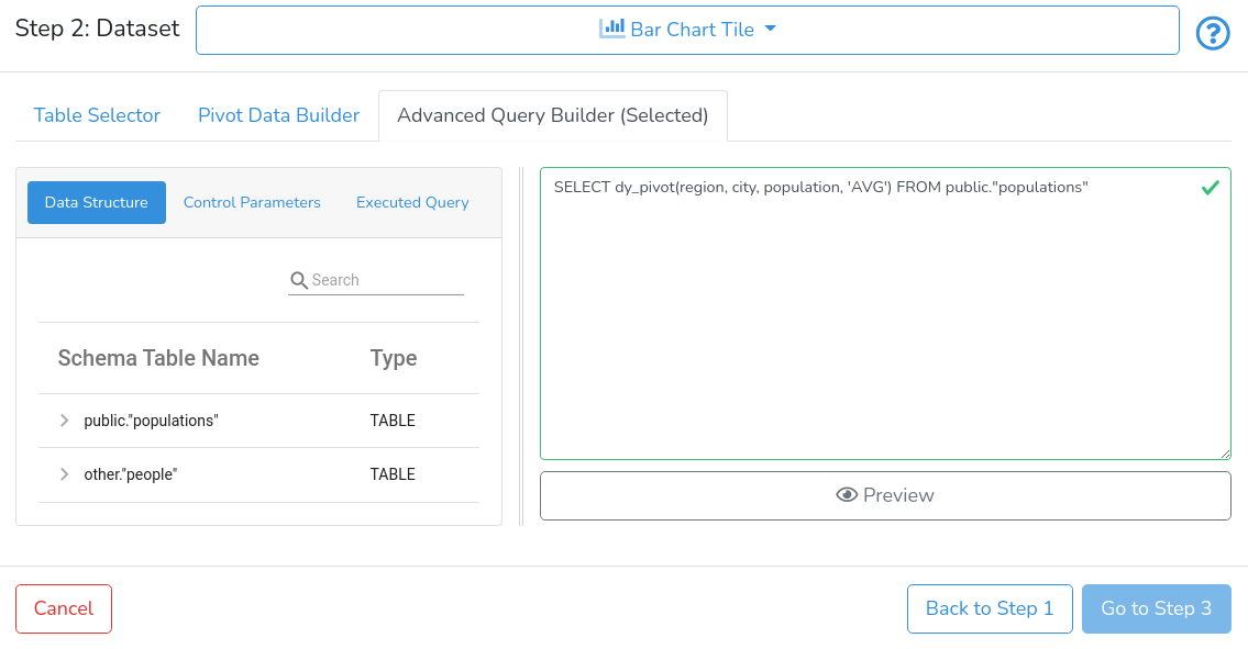
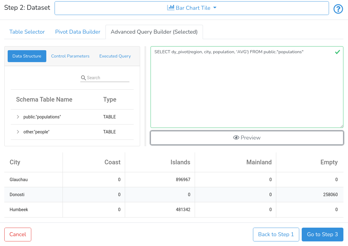
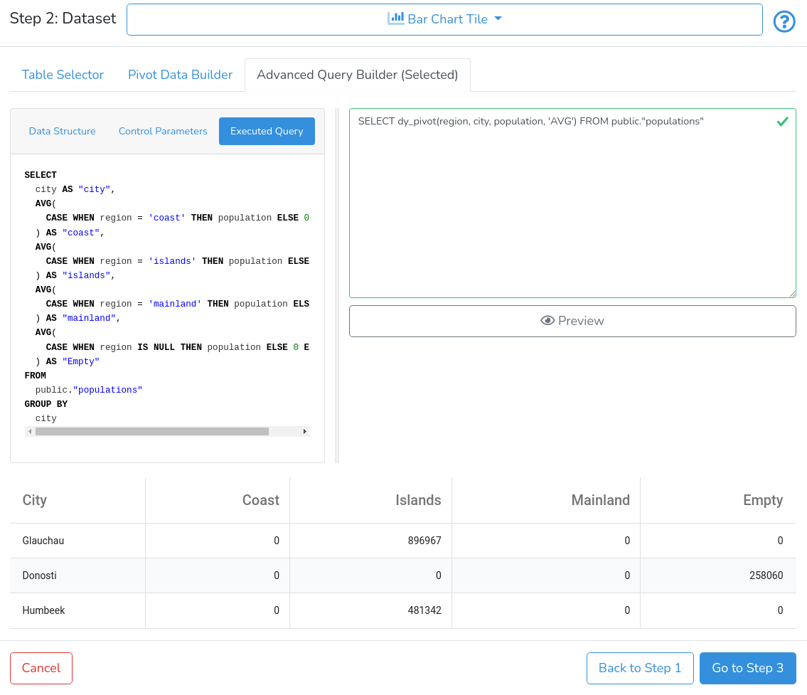
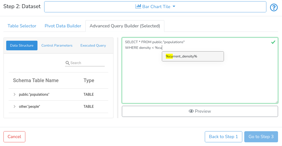
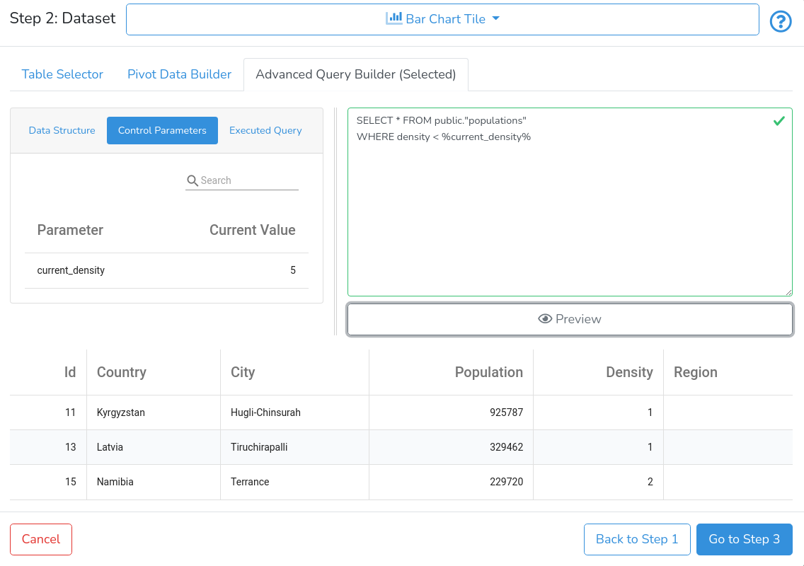
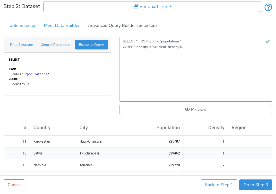
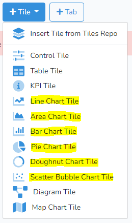
Selecting the specific chart type brings up the dialog as shown below.

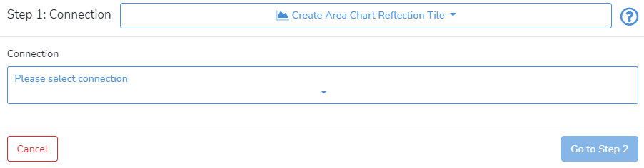
In Step 1, the user needs to select the data connection. When the data connection is selected it will show the information about the selected connection.

Next, click on Go to Step 2 in the bottom right corner.

Step 2: Dataset

In Step 2, there are three options available for preparing data for charting: Table Selector, Pivot Data Builder, and Advanced Query Builder.

The Advanced Query Builder is available only for data connections to databases.


Table Selector


Table selector lists all tables available through the data connection with the corresponding count of records, as shown below.

The user can narrow down the list of tables by typing in the search field the table name.

The user can select a table by clicking on the corresponding row and then by clicking on the Preview. An example is presented below.

Users can filter the data by clicking on the Filter button. It will open a pop-up window like in the example below.

In the Filter Builder, the user can create a data filter for the table. This is a hierarchical filter, where each layer can be linked through AND (default), OR, NOT AND, and NOT OR.  Clicking on + will allow the user to select whether to Add Condition to the existing layer or to Add Group. In every condition, the user should specify a variable, an action condition, and one or two reference values.

Adding a group will create a nested layer to the current condition.

The group plays the same role as grouping several conditions within brackets in SQL query.

Once the filter is built - click on Apply Filter to preview changes, as shown in the example below.


To close the Filter Builder - click on the Filter button again.

When the data connection is for DB - the user can copy the underlying query to Advanced Query Builder by clicking on Copy to Advanced Query Builder.


Pivot Data Builder


The other option is to create a pivot table. Click on Pivot Data Builder to switch to the pivot tab as shown below.

The sequence of steps is very similar to building pivot tables in spreadsheet applications.

First, choose the table with source data, then select the variables for data aggregations by columns and rows; third, select the variable to be aggregated and then select the aggregation function. The user should click on Preview to check the result.


The user can aggregate data across columns, rows, both or none. When none is selected, only one summary number will be produced.


The user can filter the data by clicking, first, on the Preview button to show a preview of the source table, and then on the Filter button. It will open a pop-up window as shown below.

In the Filter Builder, the user can create a data filter for the table. This is a hierarchical filter, where each layer can be linked through AND (default), OR, NOT AND, and NOT OR.  Clicking on + will allow the user to select whether to Add Condition to the existing layer or to Add Group. In every condition, the user should specify a variable, an action condition, and one or two reference values.

Adding a group will create a nested layer to the current condition.

The group plays the same role as grouping several conditions within brackets in SQL query.

Once the filter is built - click on Apply Filter to preview changes, as shown in the example below.


To close the Filter Builder - click on the Filter button again.

When the data connection is for DB - the user can copy the underlying query to Advanced Query Builder by clicking on Copy to Advanced Query Builder.


Advanced Query Builder


The Advanced Query Builder allows users to take advantage of SQL to join, filter and transform data. It is enabled only when the data connection is to databases.

For data files and direct data entry - the Advanced Query Builder is not available.

An example of the Advanced Query Builder is presented below.

The Advanced Query Builder consists of three main parts: The left pane with Data Structure, Control Parameters, and Executed Query; the right pane with a query entry field; and the bottom part - with the Preview button and data preview.

The left pane consists of three sub-tabs: Data Structure, Control Parameters and Executed Query. The Data Structure sub-tab contains a tree with the structure of the selected DB data connection. Users can browse and search the database and table structure. Tables are identified by TABLE type, while variables are identified by specific variable types. The Control Parameters sub-tab contains a list of all control parameters available in the current project. The Executed Query contains the actual query executed at the user database.

On how to create control parameters see How to Create and Manage Control Tiles.

The right pane contains the text area input for SQL code.

The DataYeet platform allows users to use several custom functions to process data. Currently, it is dy_pivot(, , , ), which produces pivot table.  Before the query is sent to the user database - all custom functions are automatically translated to plain SQL queries. Therefore, the executed query and the entered query can differ, while both do the same.

The easiest way to start with the Advanced Query Builder is to navigate to Table Selector, select the required table, then click on Copy to Advanced Query Builder to copy the underlying query to the Advanced Query Builder. Similar functionality is available from the Pivot Data Builder tab. An example of this process initiated from the Pivot Data Builder is presented below.

Clicking on Copy to Advanced Query Builder switches tab to Advanced Query Builder, and the underlying query appears in the query input field, as shown below.

Clicking on the Preview button fetches the top 3 records presented below the button.

Clicking on the Executed Query button reveals the executed query in the left pane.

The DataYeet platform offers autocomplete functionality. When suggestions are listed, users can select using the mouse click or keyboard keys Enter or Tab.

To take advantage of control parameters, users can integrate them into SQL queries. Tab Control Parameters lists all parameters available in the parent project and their current values. The control parameter should be used in queries surrounded by '%' characters. An example of the query with a control parameter is shown below.

The executed query shows that %current_density% is replaced with the current value of 5.

The tiles using Advanced Query Builder react to changes in values of control parameters. When their values change, the data is selected again using new values of control parameters. This mechanism allows linking controls in control tiles with data in content tiles.

Clicking on the Preview button fetches the top 3 records. If the data are available,  the users are able to progress to the next step by clicking on Go to Step 3.

Step 3: Chart

This step will bring up the window as shown below.

The focus of Step 3 is on chart formatting. There are five tabs with a range of settings that allow users to finalize the chart.

By clicking on Title, Legend, and Notes the user can specify the Chart Title, Legend Position, and Description, which may help with the interpretation of the chart. All these fields are optional and the user can control with the switches next to the input fields whether the information should be shown.

To edit the colours used in the charts, click on the Colours, and Variable Settings tab to switch to this section.

The user can select the colour scheme used in the chart from a range of provided options. By default - variables will get their colour sequentially from the selected colour scheme. Alternatively, the user can select a specific colour for all active variables.

For scatter and bubble charts, there is an additional option available: Tag. It specifies auxiliary data about a series.

All available variables selected in Step 2 will be listed. The DataYeet AI pre-classifies the variables based on their type and content and pre-builds the chart. The Active switch determines whether the variable is used. If the AI detects a categorical variable - the variable will be used for the horizontal axis (H: Main). The variables with the numeric content are sorted into two groups based on their range of values. Values of the first group will be shown on the left vertical axis (V: Left), and the values of the second group on the right vertical axis (V: Right).  The user can overwrite the default visualization.

To edit the chart axes, click on the Axis Settings tab which will bring up the window shown below.

The formatting options here include editing axis labels, formatting axis values, and setting their minimum and maximum values.

Zoom, Scroll, Rotate, and Pan tab allows the user to enable zoom for the horizontal and vertical axes. When zoom is enabled - enabling pan allows sliding the zoomed chart along the selected axes.

Checkbox for Visible Scroll Bar controls whether the scroll bar for the main (by default, horizontal) axis is shown.

Checkbox for Rotate Axes controls whether the horizontal and vertical axes are rotated.

By clicking on View Dataset the user can view the data prepared for visualization.

Any settings selected in the previous steps (e.g. the data connection or the table selected) can be modified by clicking on  Back to Step 1 or Back to Step 2in the right bottom corner.

The user can save a newly created chart by clicking on Save in the bottom right corner.

Next is How-to Manage Map Charts.