Step 1: Data Connection
On selecting Map Chart Tile - a dialog similar to the picture below will be opened.
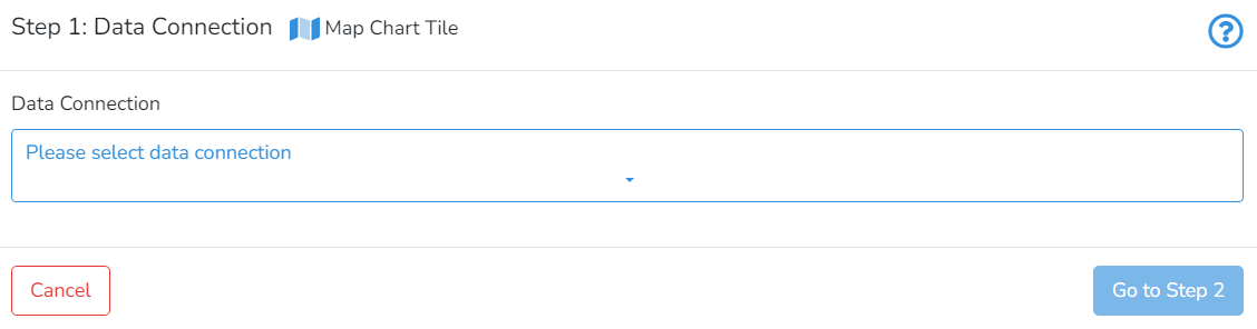
In Step 1, the user should select the connection. Next, click on Go to Step 2.


This is a tile-specific continuation of How-to Create and Manage Tiles.
This section guides users on how to create and manage map tiles.
Map chart allows presenting data for geographical areas, like countries or administrative units. DataYeet platform enables overlaying the data over the world map, or administrative units of individual countries.
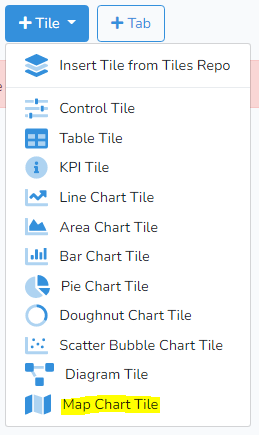
To create a new map chart click on +Tile in the project edit mode. Then select Map Chart Tile. Adding and editing the tile is done in three steps: selecting the data connection, selecting the data, and formatting the chart.
On selecting Map Chart Tile - a dialog similar to the picture below will be opened.
In Step 1, the user should select the connection. Next, click on Go to Step 2.
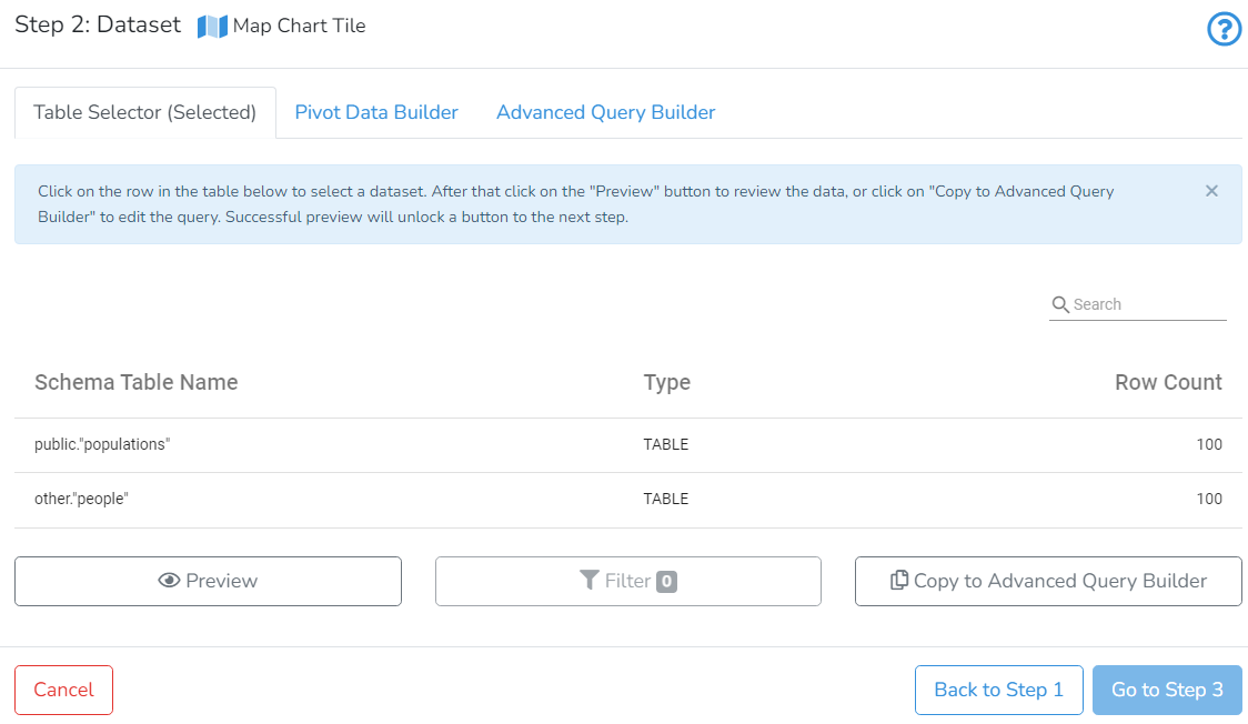
In Step 2, the user can select one of the available dataset selectors. To demonstrate this functionality, we use the data with countries' population, count of cities, average density and regions stored in the PostgreSQL database. Corresponding SQL syntax is used in Advanced Query Builder:
SELECT
    country,
    sum(population) AS population,
    json_build_object(
        'Count of Cities', count(city),
        'Average Density', round(avg(density)),
        'Regions', string_agg(region, ', ')
    ) AS json_info
FROM public.populations
GROUP BY country
The output of this query is a table with three columns: "country", "population" and "json_info". Normally only two columns, "country" and "population", are required. "json_info" was added for the advance use example.
Note: In the query above we have used aggregation functions "sum" and "GROUP BY" to produce data without duplicates by "country". For the simpler case, without an additional JSON info field, you can use a raw query, which may contain duplicates in the identification column. In that case, the platform will internally aggregate your data using "sum" aggregation.
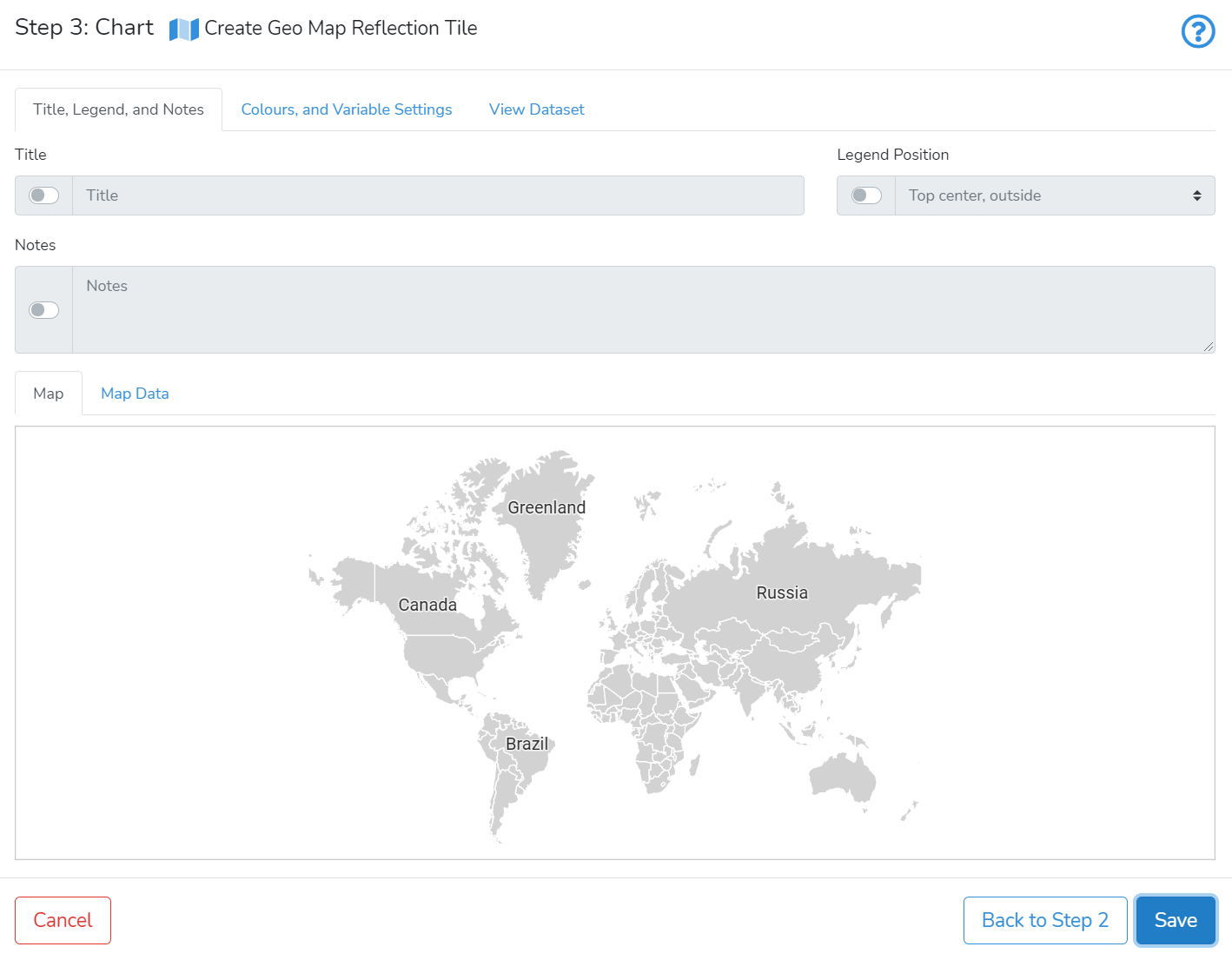
In Step 3, there are two zones: Upper and lower. The upper zone has 3 tabs that allow setting title, legend, control map-specific settings and view dataset. In the lower zone, there are 2 tabs that allow switching between map preview and map data preview.
In the upper zone, by clicking on the first tab Title, Legend, and Notes, the user can enter the map title, legend position and add notes.
In the tab Colours, and Variable Settings the user can specify map-specific parameters. The picture below shows a typical example.
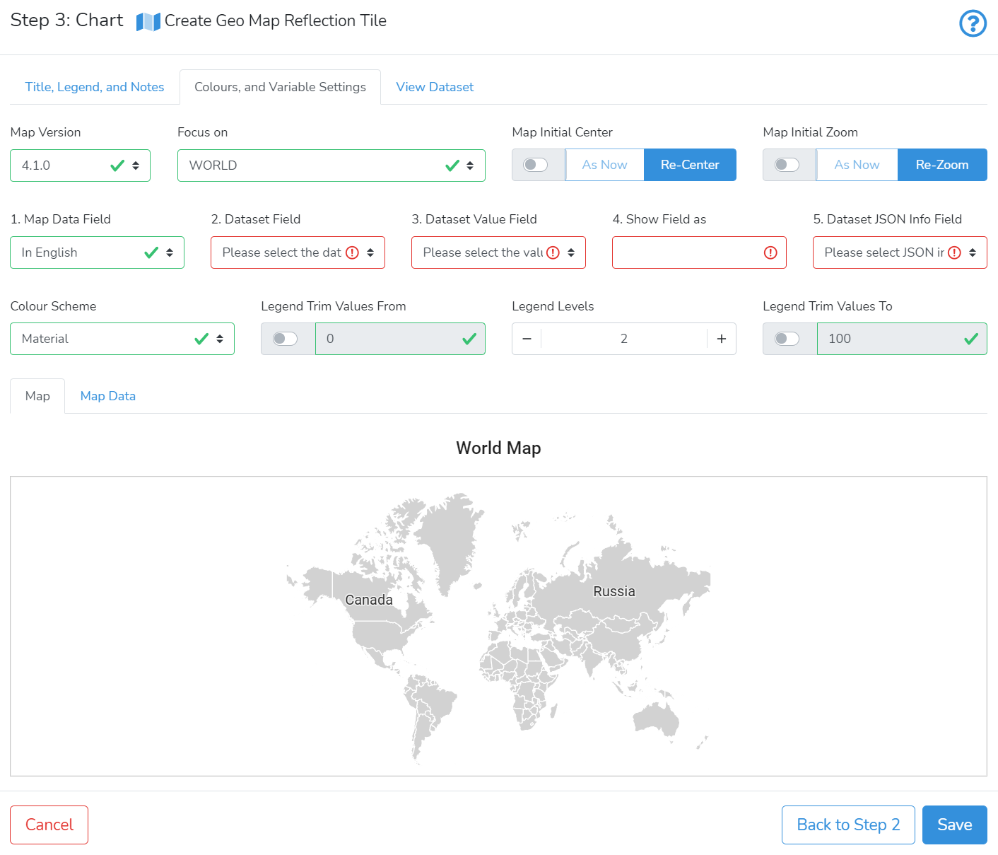
By default, the most recent map version of the map data is loaded. The map data is obtained from https://www.naturalearthdata.com/. Each version differs by a list of currently recognized countries and their names, their geographic borders, names of administrative subdivisions, and their geographic limits.
Focus on allows selecting the geographic level to focus the map. The default is World. Alternatively, the user can select a specific country.
Map Initial Center controls how the map is centred. When the switch is disabled - the map will be centred at the exact centre. Alternatively, the user can enable the switch to use a custom centre location. Then, the user should slide the map to the required position. After that click on As Now to record the selected centring. To revert to initial centring - click on Re-Center.
Map initial Zoom controls how the map is zoomed. When the switch is disabled - the map will be zoomed to show the entire map. Alternatively, you can enable the switch, then, use the mouse scroll wheel to zoom the map to the required zooming. After that click on As Now to record the selected zoom. To revert to initial zooming - click on Re-Zoom.
Numbered fields (1) to (5) define what data will be used on the map chart.
To populate the map chart - two datasets are merged by a common variable. The first dataset is selected by choosing Map Version and Focus on. This dataset contains information about geographic objects, including common identification names. The second dataset is provided by the user. It should contain a column with the same common identification names as in the first dataset, a column containing values, and, optionally, a column with JSON {text: value} pairs. Both datasets should have common identification variables by which they will be merged.
Use the tabs View Dataset (in the upper zone) and Map Data (in the lower zone) to view both datasets.
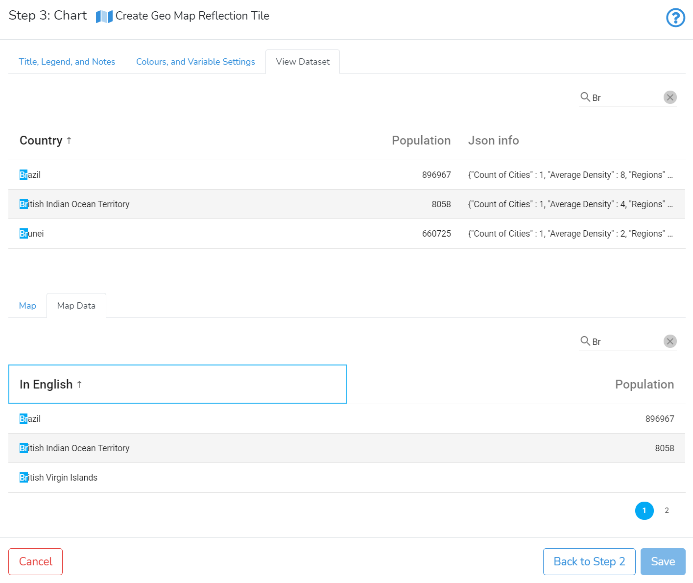
(1) To merge two datasets, select in Map Data Field column containing identification names. By default, it is "In English".
(2) Dataset Field allows selecting a field from the user-selected dataset. The column from the map data should have the same collection of identification names as in the selected Dataset Field.
(3) Dataset Value Field allows selecting a field with values from the user-selected dataset.
(4) Show Field as allows changing the displayed name.
(5) Optional: Dataset JSON Info Field allows adding additional info in a pop-up window when clicked on or hovered over the geographic area.
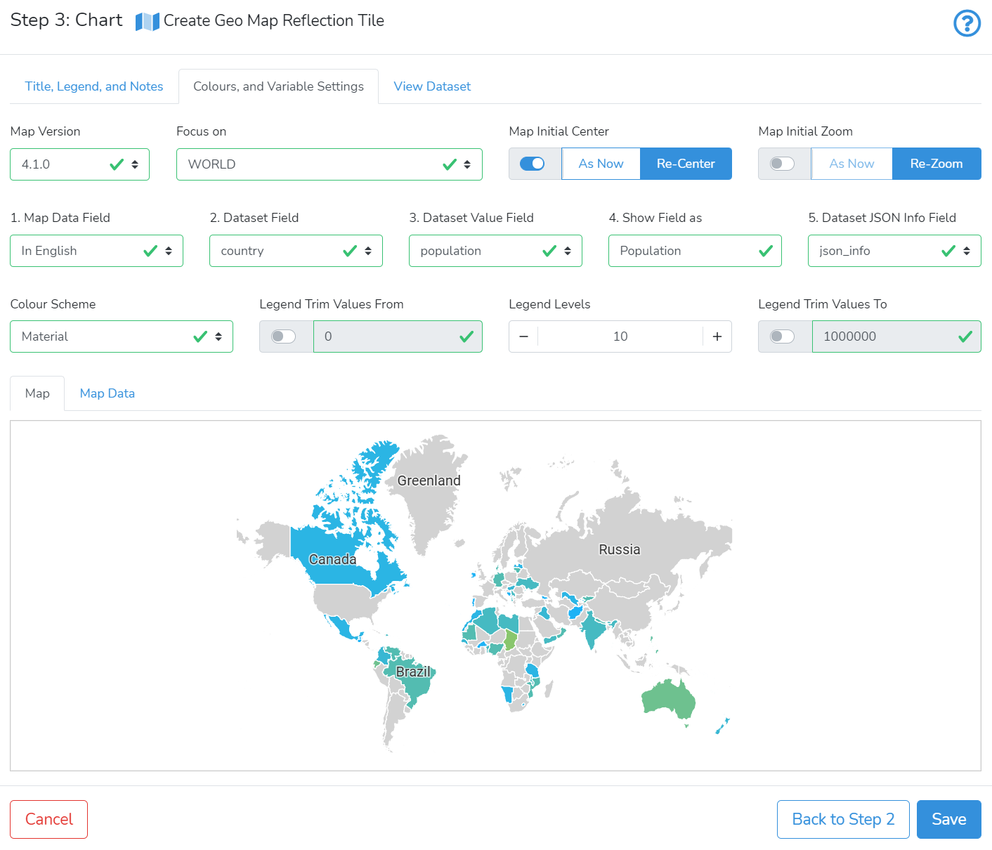
For example, in Map Data Field we can select "In English". In our Dataset Field, we selected "country". In Dataset Value Field we can select "population" as the main statistic. To show the name of the main statistic with starting capital letter - we can change Show Field as to "Population".
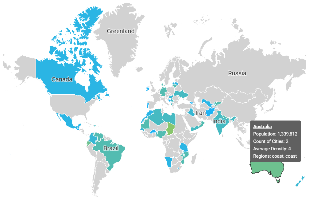
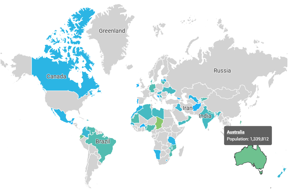
When hovered over Australia - the mock data is presented in the pop-up window.
With Dataset JSON Info Field changed to empty - only "population" will be shown in the pop-up window.
Colour Scheme allows selecting a colour scheme to present the value of the main statistic using a range of colours.
Legend Trim Values From, Legend Levels, and Legend Trim Values To are employed to assist correct mapping from values to colours.
Legend Trim Values Fromand Legend Trim Values To define the lower and upper trim for values mapping. By default they are disabled, no trim is performed.
Legend Levels sets the number of intervals used for differentiation of the main statistic values by colours. For example, if Legend Levels is set to 2 - only two colours will be used. The first one is for values below the mean value and the second colour for values above the mean value.
Once you are satisfied with selected settings - click on Save to save and add the Map Chart to your project.
Next is How-to Create Diagrams.